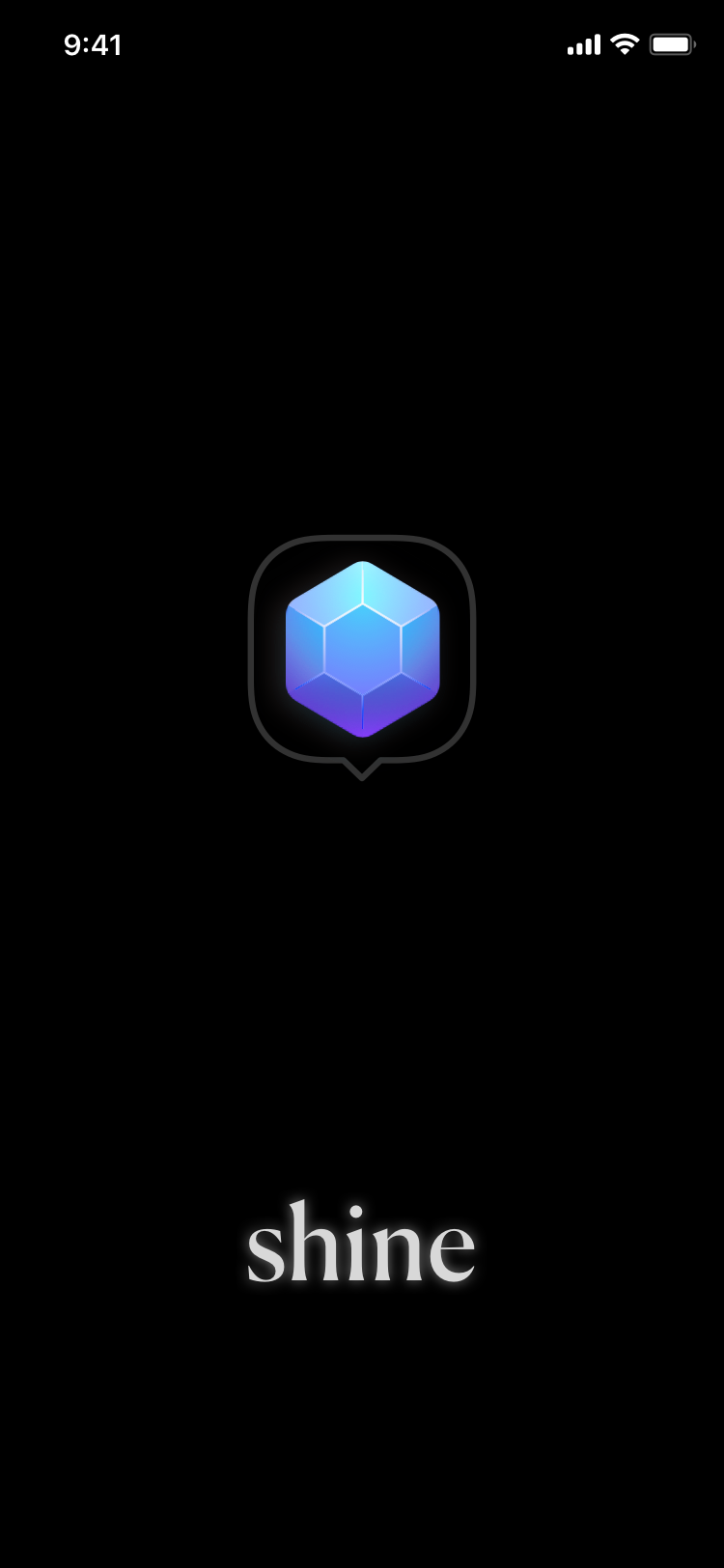
Shine iOS App Concept Screens
Concept mockups, visual language, and UI design for a client’s exploratory phase of design development. The visual language here was meant to convey a sense of premium materials, luxury, and “shine” that suited that of jewelry.Project Type
Freelance, Speculative
Freelance, Speculative
Duration
3 weeks, July 2020
3 weeks, July 2020
My Role
UI / Visual designer, Illustrator
UI / Visual designer, Illustrator
Tools
Sketch
Sketch
Overview
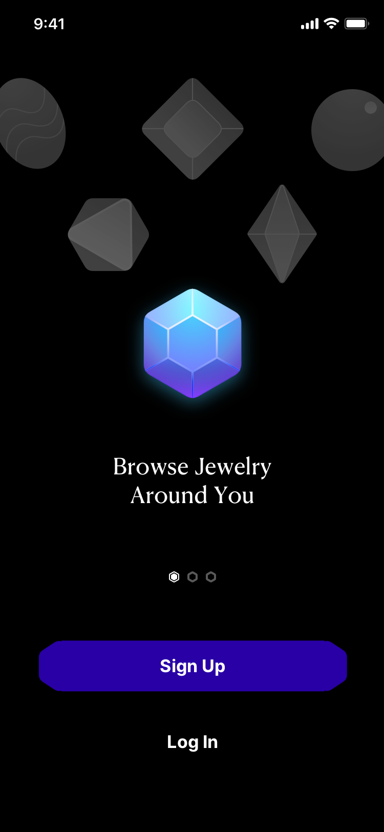
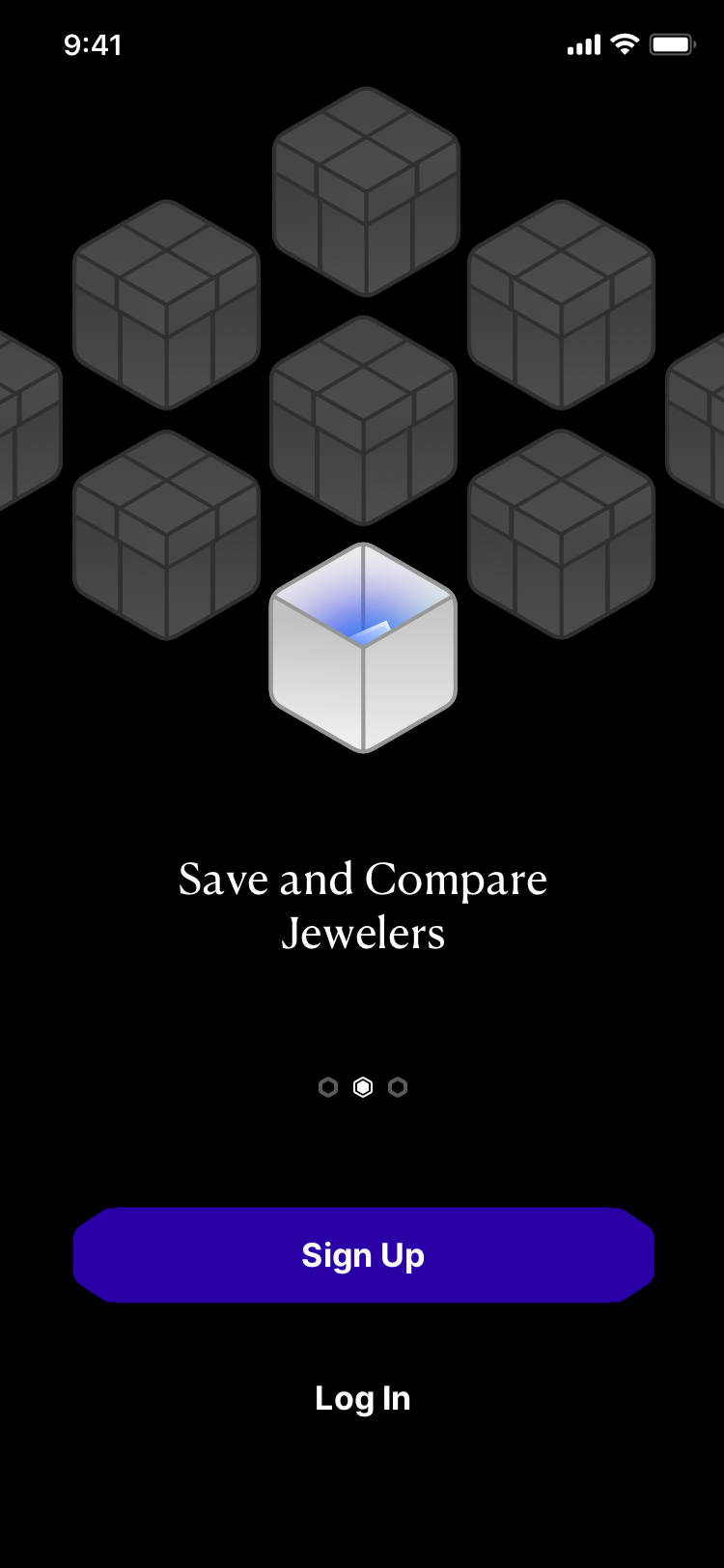
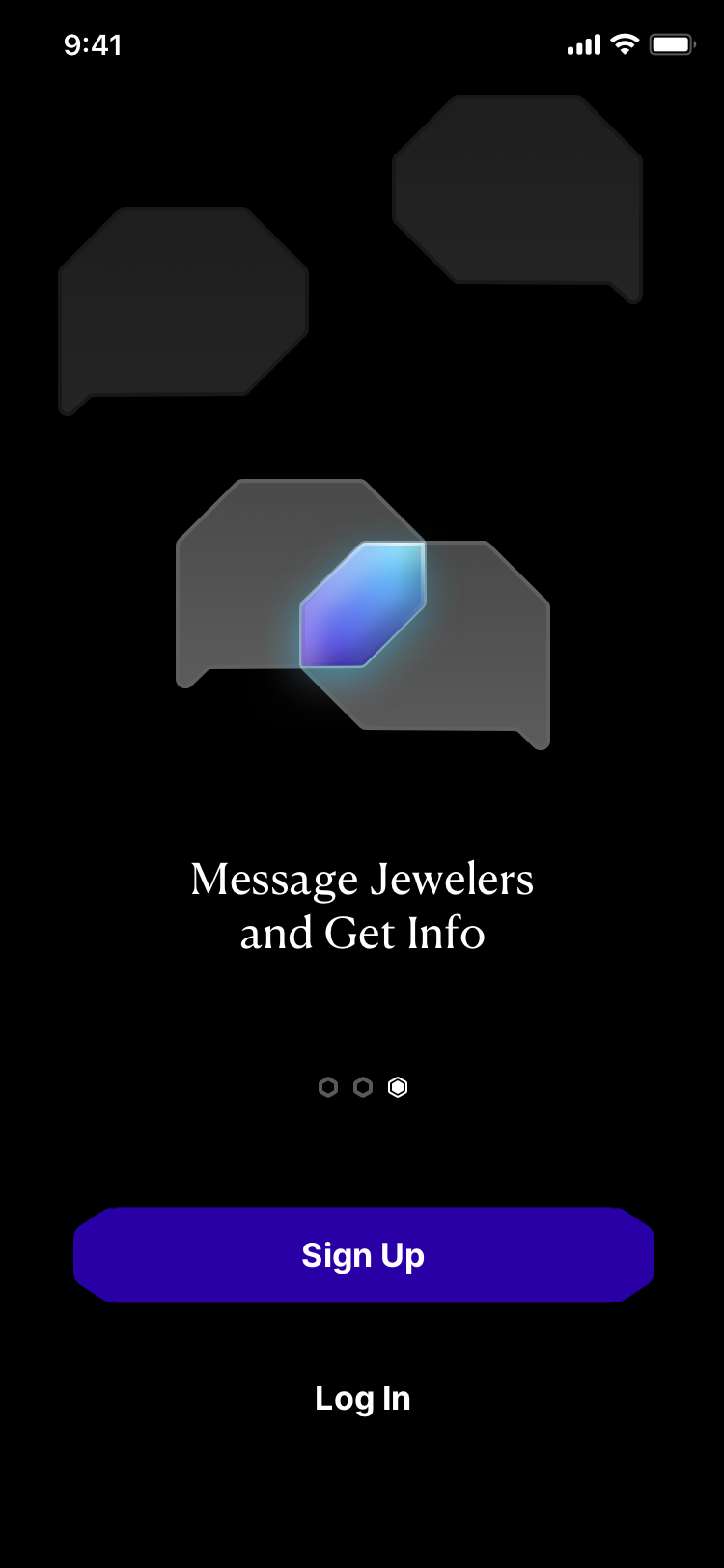
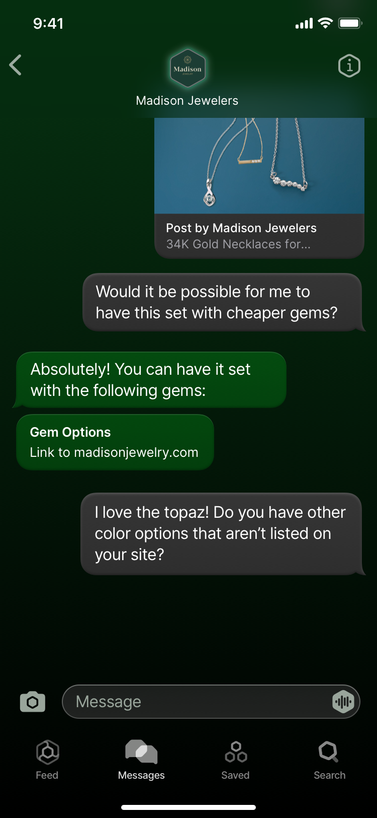
The client pitched the app as a hub for certified Jewelers to connect with customers, and for customers to discover nearby jewelers. They wanted quick mockups to get a better picture of their own idea, and I created these within ~1.5 weeks.Looking to jeweler websites for inspiration, I noted that those examples were all single-brand websites optimized for shopping, unlike this concept. So, I designed a UI that emphasized familiar social media/message app patterns & motifs and a visual language that emphasized the colors of individual jewellers’ branding, based on survey research that showed a prevailing influence of branding & social media presentation on luxury shoppers’ purchasing decisions.
After brainstorming in sketches and hi-fi logo prototypes ↗, I settled on the hexagon as a form that was able to evoke the shape of a gift box, a gemstone, and a message bubble. I also liked how its slightly rigid structure stood out from the more ornamental, dainty visual motifs that other jewelry brands tended to follow.
See project reflections at the end of this page.
Splash Screens and Login/Signup
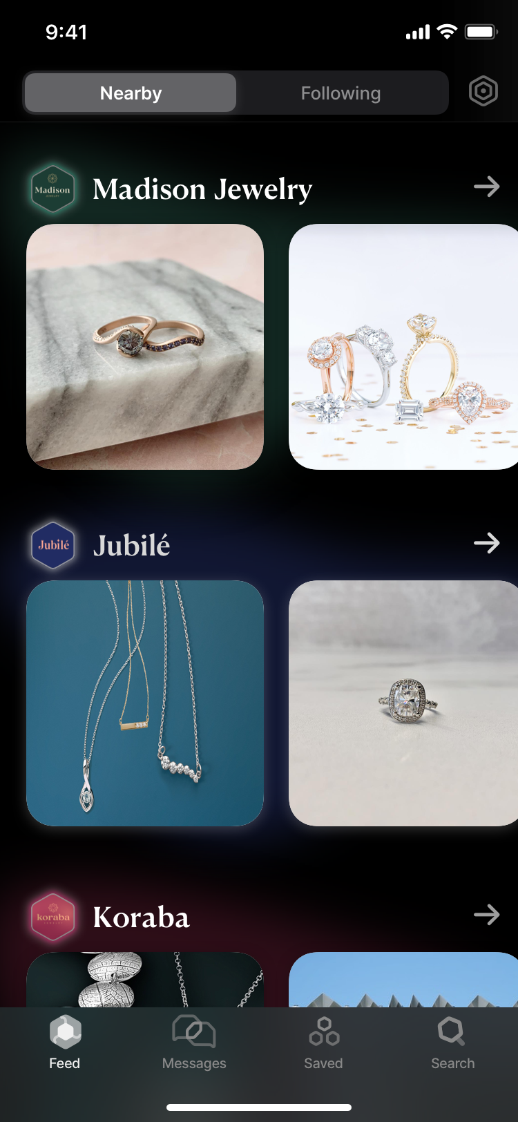
Feed Tab
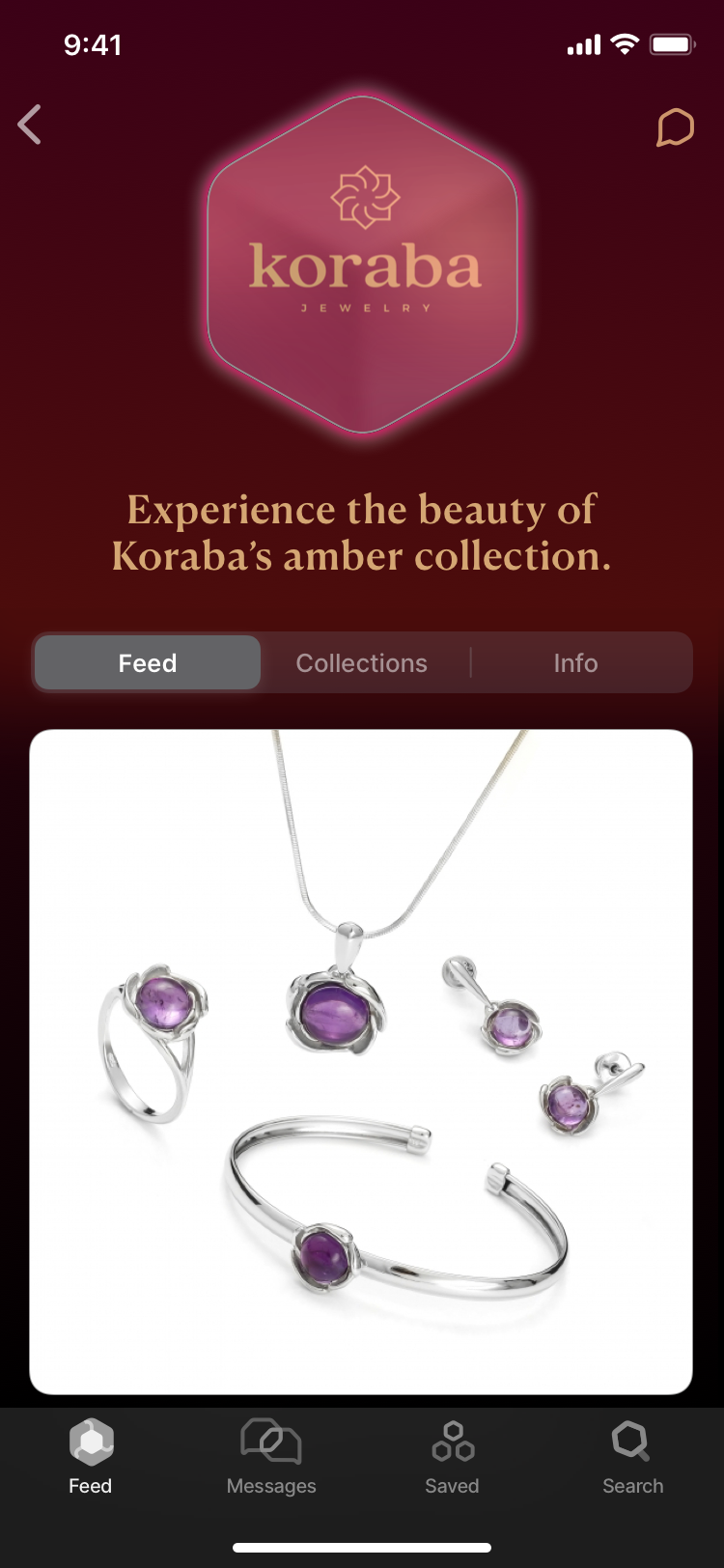
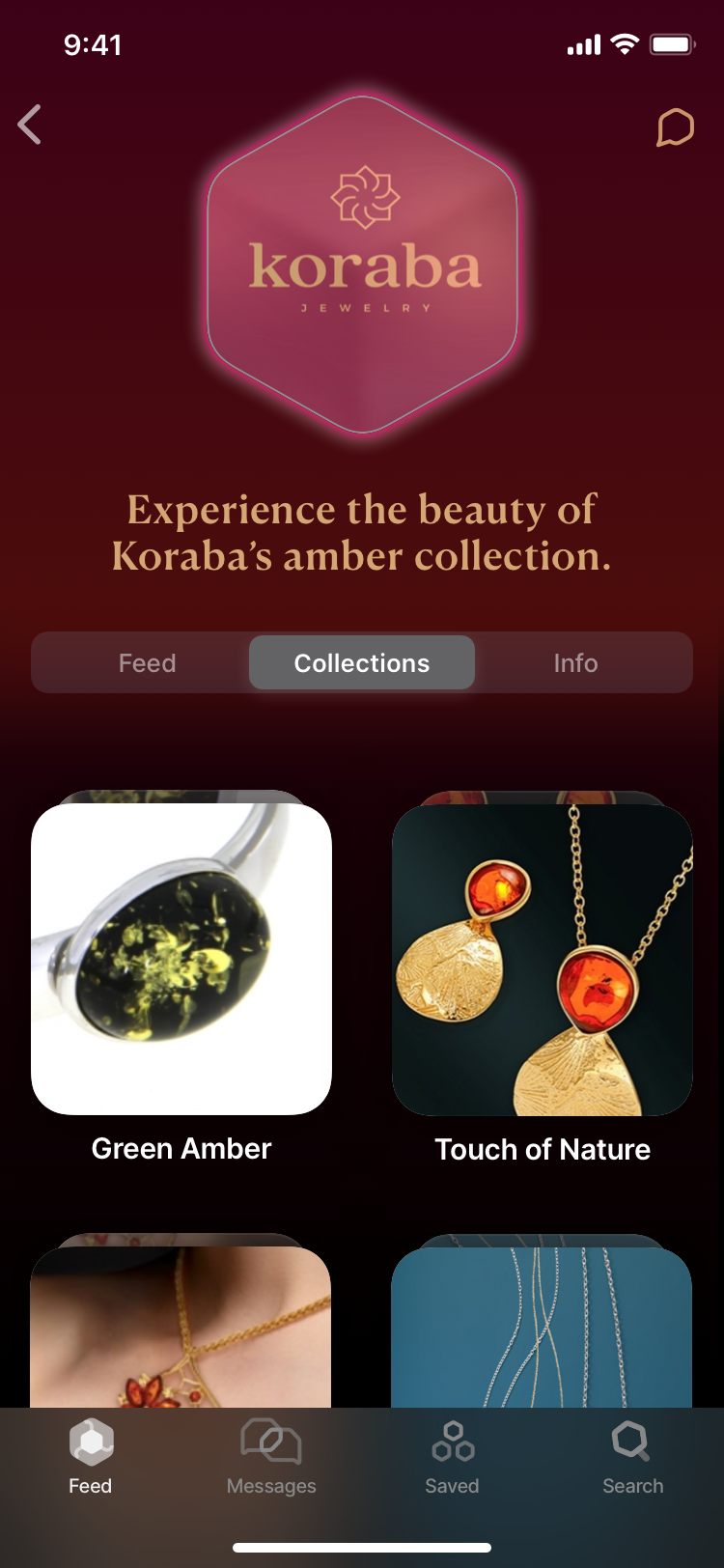
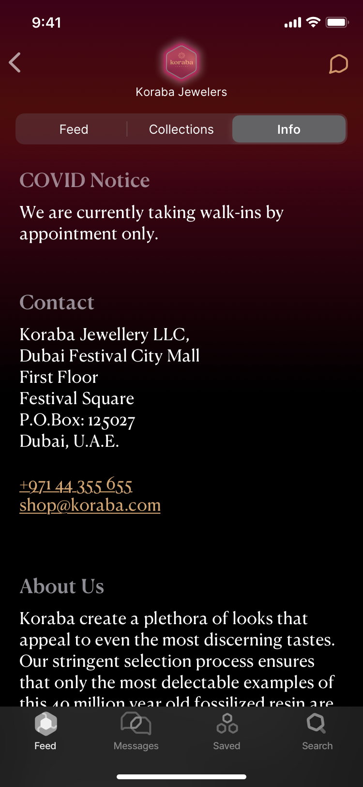
Jeweller Profile Page
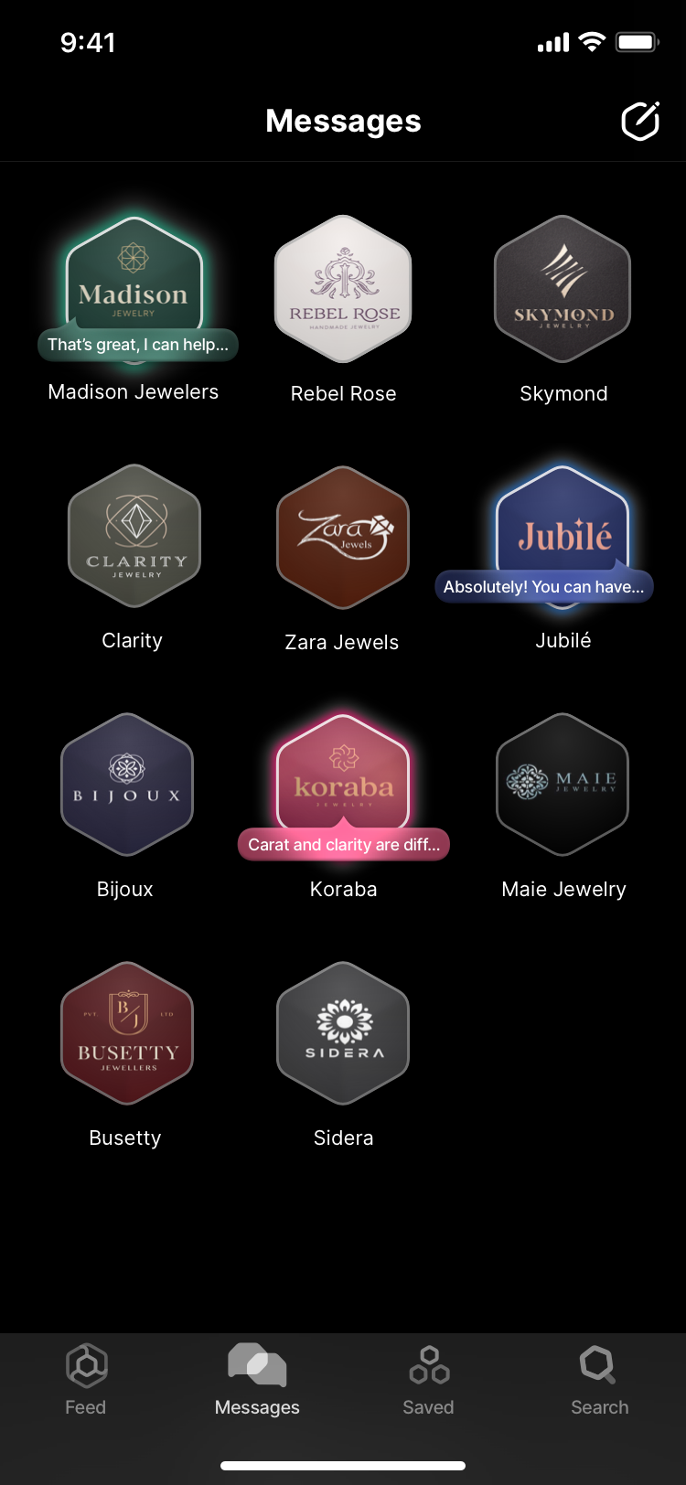
Messages Tab
Reflections
For this project, my role was limited to creating mockups based on specific features the client requested. However, I saw that the product idea lacked a distinctive value proposition. It was pitched as “Instagram for Jewelers” but did not offer much to distinguish itself from Instagram, which already offered similar features like browsing catalogs, accessing business info, and messaging via DMs—complete with a massive platform presence and user base.While I appreciated the opportunity to practice visual and UI design, I would have liked to contribute more in terms of product strategy. For instance, conducting more jewelry industry research and using surveys would help discover and validate needs specific to that industry. That info would help guide the UX and better differentiate the selling point from Instagram’s—potentially adjusting the product idea as necessary.
I’m inspired by startups that have adapted their product to suit new markets. For example, Figma started out as a 3D content generation and photo editing tool before refining itself into a collaborative, vector-based editing platform for interface & product designers. Even products that compete with “super-apps” like Facebook & Instagram can thrive by focusing on their niche or offering a unique approach. Nextdoor has a sizeable community centered on local networks, despite the existence of Facebook Groups.

All content © Nathan Cheng unless noted otherwise.
The use of any image from this site is prohibited unless prior written permission from Nathan is obtained.